Posted tagged ‘Islamic art’

Arabic Calligraphy – final curtain

April 20, 2009

I recently completed the Arabic Calligraphy Naskh script classes I was attending. These have been really insprirational, productive and enjoyable.

Mustafa Jafar did a great job of sharing the technique of traditional calligraphy using reed pens and ink and also a couple of inside tips for doing larger peices which became very handy for our final pieces. He also showed us many historial examples over the weeks of Islamic calligraphy and illumination (both secular and religious) from the famous eras of the Ottomans, Persians, Mughals, etc.

In our last class we were to present our final pieces and the only requirement was that we use the line provided by Mustafa and recreate it in our own way. Therefore there was a great emphasis on presentation and creativity through this.

I think we all got a bit competitive too with these final pieces but in a healthy and humourous way, or maybe it was just me and my sister trying to outdo eachother? Anyway as a result of this we ended up doing multiple pieces. Below are images of my three  (the second one Habibah my 9 yr old sister helped to decorate) 🙂

dsc00876

dsc00875

dsc00874

And here are images of the rest of the class’s work and Mustafa discussing each one and also encouraging us to pursue calligraphy further and also explore and experiment different ways of using it.

Before, during and after (pt2): Unveiled – Saatchi Gallery

April 15, 2009

This post is a continuation from the previous: Before, during and after (pt1): Unveiled – Saatchi Gallery

During my walk around the exhibition I was quite surprised by the vast amount of space and the room given to the work. There was also a very mixed collection of mediums – the first one I encountered was the large rubber map of Beirut on the ground floor. In a way this kind of sets the background to the rest of the exhibition – location and geography is a big issue and you can’t get more focussed on that than with this map. This subject is something that connects all the artists that were featured – their roots. They all seemed to have something to say about their origin and the cultures that came with them.
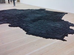
Beirut Caoutchouc by Marwan Rechmaoui

Beirut Caoutchouc by Marwan Rechmaoui

I liked the larger pieces and am always pleasantly amazed at how artists manage to produce work at such large scales, for example the towers by Diana Al-Hadid. These are not exactly pleasing to the eye and you need to look closer to see what they are made up of. ‘All the Stops’ was made with piano keys and tubes and various other musical references, structured like an organ and made from random bits of paper, card, styrofoam and painted to look almost like a grotesque organic form. According to the brochure this intentional appearance contributes to highlight the destruction of globalisation.

An 'Impossible structure' by Diana Al-Hadid

An 'Impossible structure' by Diana Al-Hadid

There were three such towers – “impossible architecture” – all similar but completely different in structure and parts. ‘The Tower of Infinite Problems’ lying on its side in two parts, was the one I preferred due to the way you had to walk around the whole thing in order to see it properly and to see how the two parts made a whole. Walking right to the far end of the room and viewing it from that side gave a completely different view. From this end it looked like a tube that gets narrower and made up of layers of hexagons getting infinitely smaller and smaller. There were also beehive like patterns on the outer layers which are quite obscurely cut and arranged in no particular way other than the need to create the basic structure. This produced quite a contrast to the inner layers, the outer looking a bit destructive but the inner with straight edges and hexagons forming neat and regular lines.

The Tower of Infinite Problems

The Tower of Infinite Problems

I have to say I dwelled more on the ones that held instant appeal for me. But gave enough time to the ones that didn’t in order to ‘give them a chance’ to ‘set an impression’. For example I would look closely at the work, suss out the techniques used and the message being conveyed if I could. It was definitely a good thing that I chose to buy the ‘brochure’ as I don’t think I read art at all the same way that others do. I guess i’m more of a literalist – in the common/contemporary sense of the word.

It was definitely a good thing that I chose to buy the ‘brochure’ in the end as I don’t think I read art at all the same way that others do. I guess I’m more of a literalist – in the common/contemporary sense of the word.

This post is already getting very long and in order to prevent this taking another month or so I cannot comment on all the pieces I saw, many of them were impressive, maybe only because of the sheer size of them, use of colours, shapes, forms and sometimes subject. I cannot claim to understand all the pieces I saw but there are a select few I must mention.

Ghost by Kader Attia. This one took up a whole room and as can be seen it looked like a room full of women kneeling in mid prayer. These women look to be covered in shawls made from tinfoil. But you walk further along and realise that the women are hollow shells, the foil being the only thing to convey their shape. The technique is very cool. In trying to guess how the realistic forms were produced you’d imagine that the artist got someone to sit in the position required and wrapped them in the foil and then pressed it down to make it compact and tight and then somehow got them to come out of the binding without tearing the whole thing apart. Obviously there must have been a more efficient method but it highly interesting to contemplate it. Especially as each ‘woman’ looks unique and individual with a slightly different pose.
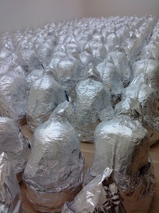
Ghost by Kader Attia

Ghost by Kader Attia


Ghost by Kader Attia

Ghost by Kader Attia

Now in this brochure it says the figures “synthesise the abject and divine” possibly because when in prayer a person is in their most humble state before God. The divine is not represented in this piece but the belief in it is. So where it goes on to say that this work questions “modern ideologies – from religion to nationalism and consumerism – in relation to individual identity, social perception, devotion and exclusion” it’s almost like the person who is writing this is trying to tick as many boxes as they can. I don’t know if this is what the artist supplied but until I do know I agree that issues of identity and social perception are the key elements communicated through this. Religion is the big one. How the women represent devotion to the Divine is clear to see and something I can relate to as a Muslim. This is something that poses many questions for me too as an artist – something I will be discussing in future posts.

I would also like to mention that I find it intriguing that in this work Attia decided to leave the faces invisible. I would be interested to know if this decision was in any way related to the idea that some Muslims believe it is not correct to portray living beings in Islam (unless completely necessary – e.g photos for ID cards etc) and especially when it comes to distinguishing facial features within art work.

Moving on I would like to mention – ‘Men of Allah’ by Ramin Haerizadeh. This is one that stood out for me – and not for the usual reasons. The images were an array of colourful, digitally manipulated body parts, small patterns and ‘tattoos’ entwining on a very dark background – therefore clear and focussed. I read the title of the work ‘Men of Allah’ and what struck me first was the amount of flesh being displayed in the work. Now the average person may not know why this is significant. But I shall explain this in just a minute.

Looking back in my ‘handy’ brochure there are several paragraphs about this collection of these images. They are based on Taaziye theatre, “a historic genre” in which very often only men are allowed to act in telling the stories of the life of the Prophet Muhammad (May peace and blessings of God be upon him). “In these photos Haerizadeh draws upon this religious ritual to stage scenes with the surreal dynamics of computer animation…” I could appreciate this work for just the medium and techniques used but that would be impossible. The method of producing as well that the intention for producing, the communication it involves and its impact are what makes a work of art what it is.

‘Allah’ is the Arabic word for God. It is used in the Qur’an as the word for God and therefore is used by Muslims. ‘Men of Allah’ therefore translates to ‘Men of God’. In the usual sense what does this mean? Perhaps someone who devotes themselves to God, the belief in Him and everything involved in the worship of Him. So far no problem right? Well let’s carry on.

Back to the brochure: “Haerizadeh’s men evolve as bacchant gods, conveying a literary mysticism in their carnal revelry…Haerizadeh reworks the codes of gender, body and sexuality. Intimately grouped and provocatively posed… in a perverse harem…epicurean and exotic”. So for anyone wondering if I was being over the top, there’s the proof from the brochure itself.

Now with this religious context in view and the use of the selected title a person who knows about this is going to wonder why the actual work holds no respect to the teachings to which it is connected.
Ok finally to the point I’m trying to make. If you’re going to even consider doing work that has any connection with the divine, spiritual, and sacred it is only right to do so with the utmost respect. I know artists who work with words/letters/poetry, producing the most beautiful artwork and even though they do not use the human form in any way they do not even go near the religious side of things. Hearizadeh clearly chose to convey an aspect of Iranian religious culture (as performing arts is not traditionally endorsed by Islamic belief) through a not so sensitive approach and as a result I find this offensive and would not be surprised if others did too.

Another collection of work in the exhibition which I can safely term as ‘controversial’ would be the ‘Tehran Prostitutes’ by Shirin Fakhim. There are a number of these life-sized puppets scattered about the room. They are made up of an array of household items and fabrics, for example knitting needles, yarns of wool and bits of lace. The body parts look to be made from sacks of cloth stuffed with more fabric, very scarecrow like. They are very scantily dressed in women’s underwear and some have abayas (long black covering worn by Muslim women) draped over the shoulders in a dishevelled manner with the revealing and vulgar and ill-fitted lingerie on full display. The impression of ‘ladies of the night’ is definitely achieved using a stark ‘in your face’ approach. I didn’t want to look at these for longer than I needed to. I know it’s a reality of life – women around the world are involved in this illicit behaviour but I was slightly confused by the artist’s choice of addressing the issue?

I guess exhibiting this kind of work in a Muslim country would have been very risky for the artist. Therefore this kind of exhibition offers them a level stage where there will not be as much judgement and scorn towards their work.

Flesh on display is taboo enough let alone an underworld of prostitution which the average and common public tend to ignore. Then there are the additional signs of other illegal and black market activity:
“Issues such as female genital mutilation, transgender orientation, homosexuality and cross-dressing are all awkwardly broached through her vulgar approximations of stitched crotches and mismatched private-bits, confusing the brutal, illicit, forbidden and desirous.” There is something of a shock-value here, right?
There is an underworld of prostitution even in Muslim countries where fornication and adultery are against Islamic law let alone this array of activity. But it still thrives because there are women – and according to the above even men – out there who need money and as long as there is demand there will be supply.

Fakhim, however, has chosen to treat this serious subject with humour and uses the situations of the ‘characters’ and the lives they portray as one big joke – ok maybe that is a bit harsh but it’s certainly not sensitive; “Fakhim ironically stages this menagerie as a source of ridicule, provocatively placing items such as alms baskets and air fresheners to illustrate public scorn and social stigma.” So in the end the purpose of this work is simply to highlight the situation and how it is placed within a strict culture but as the majority of people will agree it is something unwanted in general society – is there not a better message that can be conveyed? If we were made to feel sorry for these people and be led to think of how they could be helped instead of laughing at them – perhaps that would be more effective? Utopia doesn’t exist but there’s nothing wrong in trying to make this a better world.

Patterning

March 9, 2009

I’m really disappointed because I’ve realised that I won’t be able to get my proto-type finished in time for my mid-point review. I think it would have received a really good reaction from my peers.

But I don’t even have time to dwell on it and have cracked on with things so that I have something half decent to show.

The point of the mid-point review is for my peers and tutor to see where I am so far and as this is taking the form of a group crit (much like the one the full-timers had last month – see earlier post) it means that they need to try and understand what I present to them without me having to explain anything. But even if they completely misunderstand it help me development and amend where I’m going with the work so that I can head it in the right direction from then on.

As I’ve been exploring the traditional methods for producing Islamic geometric patterns (which is a new practice to me) I am quite proud of where I’ve got to so far – but will anyone else seeing it for the first time appreciate the result of my hard work? Also, would they need to have an interest in this area in the first place to then appreciate this type of art?

What will be most annoying is that these examples I will show are just on paper/card. And I wanted something digital and interactive at this stage. Honestly, it would have been way ahead of the game for me to have something ready at this point of the course that was a working prototype of an interactive work but it would have been cool because at least the rest of the students would understand where I was going with this. Anyway, I have faith that they will ‘think/look outside the box’, so to speak, in regards to my work – whether they like it or not.

In the above gallery are images of the stages I went through to get to the last piece which is a large hexagon broken down into further hexagons, triangles and circles to produce a geometric pattern.

You will notice that I go back and forth with the first grid designs and this is because I did soo many sheets, and at some stage or another I would realise that I had made a mistake and would need to start over. The grids or patterns wouldn’t look wrong and wouldn’t necessarily be wrong in themselves but I was trying to follow a particular strategy as laid out in an example from Daud Sutton’s book ‘Islamic Design: A Genius for Geometry’. I wanted to follow this to a ‘T’ up to a certain stage. So until I got to that stage – if everything wasn’t exactly like he’d shown then it would be wrong.

After producing the ‘grid’ and formations of hexagons within circles I then photocopied the sheets so that I could develop the patterns within the grid further. This was the stage where I would finish copying the book and start my own additions in patterns. If I ruined these photocopies I would still have the original larger grid to go back to. After deciding on the main hexagons (one large and one small) to break down further I then inked the designs on to another photocopy. I then photocopied this (yeh I know – there are trees out there waiting for revenge) so that I could cut out the main shapes within these bigger shapes. The handy thing about the cut-out template is that I can then put the shapes together on a large plain sheet of paper which has no grid and the hexagons fit together as they are already proportioned correctly, the grid would therefore be invisible.

I like the effect of light coming through these cut-outs. This is why I would love to experiment with light and how it could be used in an interactive way at some stage of my project.

This is where I moved on to the large A3 black card and started drawing out the very large hexagon made up of smaller hexagons and filled these in with the designs from the templates I had cut. Then after filling in all the parts I was left with the final design (below) which I am quite happy with – it looks much better in reality as the pencil shimmers with light and is a great contrast to the black card.

pencil on black card

Tonight I plan to turn this in to another template and have further uses for it – so watch this space 🙂

The very Grand Mosque in Muscat, Oman

March 8, 2009

I’ve been back a week now and I thought I would have been blogging straight away but alas I’ve been completely run off my feet. Admittedly the first couple of days after I came back from holiday I felt like I should give myself time to adjust from being all relaxed and lazy into being in a super productive mode. Who was I kidding – it was just a waste of my own time and now I am paying for it.

But going to Muscat was great for inspiration. The Grand Mosque was especially beautiful and abundant in colourful and varying examples of geometric patterns. The architecture had all the usual features of a major mosque: minarets, arches, courtyards and an ornate prayer hall. It was spacious and clean and even minimalist in a way (except for the prayer hall which appeared to be a grand showpiece of the local craftsmanship), for the majority being large blocks and shapes of white stone and marble. Whilst walking around I found alcoves and crevices where patterns decorated the space with colourful tiles or simple engravings and cut-outs. As we were there in the morning and the sun was shining in all its glory, the effect of the light, forming shadows, reflections and generally brightening the whole place up, seemed almost like a dream. I am so glad we faced the 30+ degree temperature to venture over that day.

For those visitors who were unfamiliar with this style of decor and the history and relevance of it, there were plaques with brief explanations of why the chosen styles were used (please see gallery).

I have to say I do enjoy photography even though I’m not that familiar with all the settings that can produce better images. With my own photos I think composition works best and I like to convey the different views of a building – how it looks completely different when looking from even a step away from the previous view.

Anyway, these patterns made me realise that I want my work to be focused on a contemporary take on the everlasting traditional geometric patterns used in the Islamic world. So I just need to produce my own ones through a different medium. Not too hard right? Actually, it’s very hard just trying to decide which medium to use. But for now, with less time on my hands than I had anticipated I’m going to concentrate on making some pretty patterns of my own. Which means I need to go back to practising the traditional method I failed to complete last month.

Nja Mahdaoui

October 20, 2008

There is this feeling you get sometimes when you see/hear/watch something astounding and it gives you the shiver-me-timbers, as I like to call it. It’s a positive feeling in most cases and it’s like wow this is so amazing/funny/beautiful…or any other superlative you deem fit for the description.

Anyway so I received this giant book of one artist’s work when I attended the Word into Art Exhibition in Dubai. It was so heavy that the thought of carrying it on to the plane to Pakistan (where I headed on to next), keep it in good condition there and then carry it back to London via Dubai two weeks later, on the way back home was quite daunting. But the one reason I went through all that (and no it wasn’t because it was a well printed free book) was because the work of this artist gave me the shiver-me-timbers. Nja Mahdaoui is the name of the Tunisian born artist whose work I am now on about.

I can’t even attempt to describe the beauty of the work and obviously this is very subjective as it appeals to me in many ways and for various reasons. I will try and list these later but first let me show you the work. And because I like so much of it I am not going to limit the amount in this post – prepare yourselves!

All these images are from Mahdaoui’s official site: http://www.nja-mahdaoui.com/index.php

Canvas


Parchments

Airplanes

Yes you read correctly – one way of knowing you’ve made it as an artist is when you’re work is used on a series of airplanes! See this webpage for more images http://www.nja-mahdaoui.com/gb/avion1.php


And now I insist you look around the rest of Mahdaoui’s site to see how his work has been transferred to buildings; stained glass elements of which add a vibrancy to structures that can sometimes be, well, boring. His designs have also been incorporated onto dresses, and by the looks of it, many more mediums which we are promised will be displayed on the site “soon”. These include papyrus, jewellery and tapestries.

Oh yes. Why do I like these works? Here is a quick list which is by no means complete or fully explained:

Colours. Mainly black and white is used (my favourite combination for detailed works of these type). Other colours are from a select palette and mean that the work is consistent and have a sort of organised ruling to them. They also remind me of Piet Mondrian’s choice to use only primary colours in his work (more on him in a day or so).

Block type shapes. These can be especally noted from the contrast to the flowing calligraphy. These shapes are formed not only by the background colours or the flow of the text but also from the way they work as borders to new segments within the layout of the more geometric designs.

Empty space. This is used effectively. Amongst all the detail and condensed text there are some gaps that allow for the design to breath. They emphasise the parts that are filled with the lines of text (thick and thin) and also the different shapes created in the overall composition.

Straight edge and curves. This is great – I love the way the spiralling rose effect is centered within a rotated square in one. Again this is seen where there are circles within squares or overflowing of curves from the calliugraphy spilling onto a backdrop of straight and geometric edges/blocks of smaller concentrated text. Once again I think this contrast just helps to play one off against the other but to highlight the aesthetics of each and not to compete.

Calligraphy. This is a major form of illumination and decoration in Islamic art. An area I am hoping to explore later in my research. But for now I think the above examples really do a great job of showcasing the variety of designs and compositions possible in the art of Arabic Calligraphy which in the Islamic world has become reknowned. It is a fine art in itself and must be practised for years to be mastered.

Feel freel to comment on any aspects you feel should be mentioned that make these works good or perhaps not as good as you think they could be? I’d definately be interested to hear others’ opinions 🙂